• Skip to content
  • Skip to primary sidebar

Right Attitudes

Ideas for Impact

[Presentation Skills #5] Effective Fonts for Presentations

October 6, 2008 By Nagesh Belludi 1 Comment

Serif and Sans-Serif Fonts

Font families are classified according to their appearance: serif fonts, sans-serif fonts, monospace fonts, cursive fonts, fantasy fonts, etc.
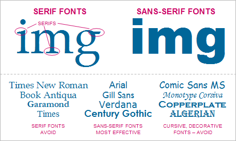
Effective Fonts for Presentations

Characters in serif fonts have little projections or ‘tails’ (serif = tail in French) at the end of strokes and line widths that thin out on curves. The serifs guide a reader’s eyes to flow across lines of text. Conventionally, serif fonts are used for smaller text such as blocks of texts in newspapers. Serif fonts are harder to read from a distance. Examples of serif fonts are Times New Roman, Times Roman, Garamond and Palatino.

Characters in sans-serif fonts have more consistent line widths and do not have tails (sans = without in French.) Sans-serif fonts appear clear, fresh and balanced in shape and form. Conventionally, sans-serif fonts are used for larger text such as headlines or text in posters. Sans-serif fonts are the most popular choice for on-screen (TV, computer, etc.) text because of their clarity in display. Examples of sans-serif fonts are Helvetica, Arial, Futura and Verdana.

Fonts for Presentations

  • Sans-serif fonts are perhaps the best choice for presentation design because sans-serif fonts are more legible than serif fonts when projected.
  • With serif fonts, given the limited resolution of projectors, some of the thinner strokes tend to break-up or disappear when projected, especially at smaller sizes.
  • Characters in monospace fonts (e.g., Courier New and Monaco) each occupy the same amount of space. Use monospace fonts for tabulated information or computer console output only.
  • Cursive or decorative fonts easily distract the eye and make a presentation look unprofessional. Use such fonts sparingly in presentations.
  • Avoid using more than two fonts in a presentation; too many fonts lead to inconsistency in visual design.

Font Sizes: Larger the Better

Font size is measured in points. A point represents 1/72 of an inch; text in 72 points prints to text of one-inch height.

The choice of font sizes is dictated by the size of the room in which you will present. Choose a font-size that will make all of your text readable to everyone in the audience. Use font sizes of 32-48 points for slide titles and headings and font sizes of 24-32 points for the rest of the content.

Wondering what to read next?

  1. Two Essential PowerPoint Slideshow Tips
  2. Why Good Founding Stories Sell: Stories That Appeal, Stories That Relate
  3. The Rule of Three
  4. Persuade Others to See Things Your Way: Use Aristotle’s Ethos, Logos, Pathos, and Timing
  5. Jargon Has Its Place in Business Communication

Filed Under: Effective Communication Tagged With: Presentations

Reader Interactions

Comments

  1. Peter Bowler says

    October 14, 2008 at 6:50 AM

    An excellent summary of the issues involved with typeface and font selection for a presentation. One thing that we note on our courses is the over-use of colour in text; either too many colours to a slide or inappropriate colours. Not many of us can read the presentation’s yellow text at the back of the conference room. Blue and black text seems to work the best for presentations. Both red and green text causes problems for legibility.
    Peter
    Presentation Skills Training

Leave a Reply Cancel reply

Your email address will not be published. Required fields are marked *

Primary Sidebar

Popular Now

Anxiety Assertiveness Attitudes Balance Biases Coaching Conflict Conversations Creativity Critical Thinking Decision-Making Discipline Emotions Entrepreneurs Etiquette Feedback Getting Along Getting Things Done Goals Great Manager Innovation Leadership Leadership Lessons Likeability Mental Models Mentoring Mindfulness Motivation Networking Parables Performance Management Persuasion Philosophy Problem Solving Procrastination Relationships Simple Living Social Skills Stress Suffering Thinking Tools Thought Process Time Management Winning on the Job Wisdom

About: Nagesh Belludi [hire] is a St. Petersburg, Florida-based freethinker, investor, and leadership coach. He specializes in helping executives and companies ensure that the overall quality of their decision-making benefits isn’t compromised by a lack of a big-picture understanding.

Get Updates

Signup for emails

Subscribe via RSS

Contact Nagesh Belludi

RECOMMENDED BOOK:
The Effective Executive

The Effective Executive: Peter Drucker

Management guru Peter Drucker's insightful perspective and suggestions for making executives more effective managers of both themselves and others.

Explore

  • Announcements
  • Belief and Spirituality
  • Business Stories
  • Career Development
  • Effective Communication
  • Great Personalities
  • Health and Well-being
  • Ideas and Insights
  • Inspirational Quotations
  • Leadership
  • Leadership Reading
  • Leading Teams
  • Living the Good Life
  • Managing Business Functions
  • Managing People
  • MBA in a Nutshell
  • Mental Models
  • News Analysis
  • Personal Finance
  • Podcasts
  • Project Management
  • Proverbs & Maxims
  • Sharpening Your Skills
  • The Great Innovators

Recently,

  • Why Major Projects Fail: Summary of Bent Flyvbjerg’s Book ‘How Big Things Get Done’
  • Managing the Overwhelmed: How to Coach Stressed Employees
  • Inspirational Quotations #1120
  • The ‘Small’ Challenge for Big Companies
  • How to … Lead Without Driving Everyone Mad
  • Be Careful What You Count: The Perils of Measuring the Wrong Thing
  • Inspirational Quotations #1119

Unless otherwise stated in the individual document, the works above are © Nagesh Belludi under a Creative Commons BY-NC-ND license. You may quote, copy and share them freely, as long as you link back to RightAttitudes.com, don't make money with them, and don't modify the content. Enjoy!